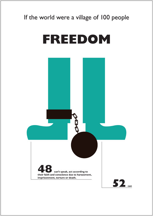
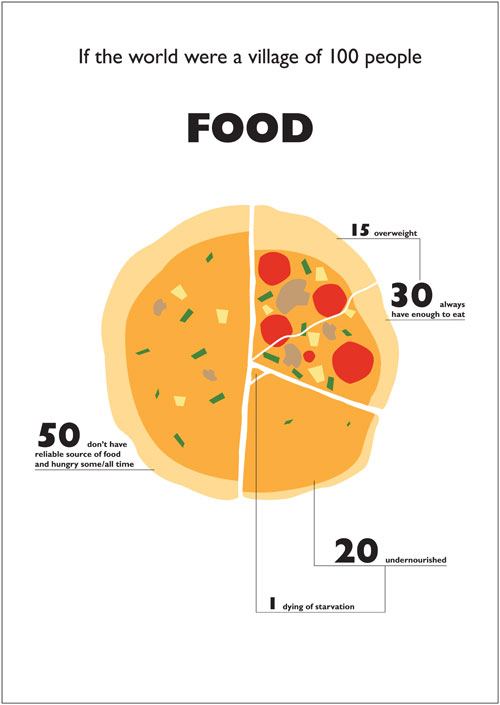
Brilliant infographics: The World of 100
Posted on | October 27, 2009 | No Comments
Just stumbled upon this piece at Brainpickings, which points to a brilliant infographics website named The World of 100 made by a guy named Toby Ng. It visualizes statistics of the world in percentages boiled down to what he visualizes ‘if the world were a village of a 100 people’.
See a couple of great picks below – and check out the entire piece here.


Category: Art, Climate, Politics, Rights issues, Social justice
Tags: Brainpickings > Infographics > Toby Ng
Tags: Brainpickings > Infographics > Toby Ng
Comments
Leave a Reply


